Flora Cafe Website

Designed a website for a locally-owned cafe in San Diego. Client work.
Role → Web designer
Timeline → Jan. 2025 - Apr. 2025
Software → Figma

01

Context and overview

What's on the menu?

This was a 10-week website design project where my team worked with a real client to create a complete web design for them that meets or exceeds their expectations, by working with them to understand their goals, needs, and opportunities. We chose our client to be Flora Cafe in Bonita, CA.

What I did

  • I spearheaded the mobile-facing web design, contributing to all aspects of the design process from wireframing to prototyping intended interactions.
  • I helped in gathering insights from our client through a 70-minute in-depth interview with the owner of the Flora Cafe, in which we determined the essential features for their first version of the website and defined our target audiences.
  • I performed competitive analysis on similar cafes in the San Diego area, seeing what we could borrow from successful websites.

02

User interviews

Visiting Flora Cafe in person

To get a better understanding of our client's goals, preferences, and priorities with her ideal website, we decided to visit her wonderful cafe in person to interview her.

The grilled cheese and tomato basil soup was delectable!
After filling my stomach up, we got to interviewing. These were our main insights:

Goals

  • Create a warm, welcoming website that reflects the café’s cozy, floral atmosphere.
  • Attract more to-go customers and support future online ordering through Toast.
  • Showcase the café’s uniqueness and community feel to stand out from chain competitors.

Preferences

  • Floral, mid-century modern aesthetic with green/pink tones and gold accents.
  • Clean, elegant typography consistent with in-store branding.
  • Include chef/storytelling elements like recipe origins and local sourcing.

Priorities

  • Emphasize freshness and authenticity — everything made in-house with trusted vendors.
  • Highlight vegan-friendly offerings and premium coffee/matcha.
  • Strengthen brand identity through design and storytelling rather than traditional marketing.

But wait... reality check!

Reading these goals, preferences, and priorities for a brand-new cafe's website makes sense, right? "Clean, elegant typography"... "Emphasize freshness and authenticity"... all sounds great and all. But those are assumptions!

Both us and our client may think we have a good idea of what makes a proper website that users (customers) want to use, but we very well could be wrong. That's why we decided to conduct user interviews with people who make up a majority of her customer base.

‍During our user interview phase, we interviewed 9 potential customers, from which we concluded that there are three types of personae: studious student, middle-aged mom, and café fanatic. Each grouping represents the primary demographic range of Flora Cafe and illustrates which groups of users are the most ideal to target.

For each persona below, we developed a few user scenarios and use cases and concluded analytical tables to help us refine our main website design focuses: 1) appealing menu, 2) cafe location and hours, and 3) display interior design.
After conducting those interviews, we had a few core findings about Flora Cafe's customer preferences when it comes to cafe websites.

Visual aesthetic that matches the cafe's vibe

All interviewees emphasized the importance of a website’s visual appeal, noting that it should reflect the personality and atmosphere of the café itself. They were drawn to clean, curated designs that felt intentional—whether that meant minimalist layouts for a modern coffee bar or playful colors and retro typography for a more casual space. High-quality images were especially valued, helping users quickly get a sense of the café’s offerings and interior vibe. Full-bleed photos, gallery-style menus, and well-composed shots of drinks, food, and the space were seen as both functional and inviting. Ultimately, participants felt that the visual design and aesthetic choices (color palette, typography, layout) served as a first impression—an outdated or generic site gave the sense that the business lacked attention to detail, while a thoughtfully designed site built trust and excitement.

Location, hours, & accessibility front-and-center

Every participant emphasized the importance of quickly finding essential information like the café’s location, hours of operation, and contact details. They appreciated when this information was easily accessible—ideally at the top of the homepage or as a sticky element. The presence of a map or a clearly listed address was helpful, and some interviewees also mentioned wanting tips on parking or nearby public transit options. When this information wasn’t immediately visible, they reported leaving the site out of frustration.

Easily digestible menu preview

Participants consistently preferred menus that were well-organized and easy to digest. Many liked when menus included thumbnails or were sorted by categories, allowing for a quick visual scan of offerings. Descriptive text was fine as long as it was kept short, but long paragraphs or text-heavy menus were a turn-off. Everyone appreciated when prices were listed clearly, and while PDFs were acceptable to some, they had to load quickly and be well-designed—otherwise, people would just abandon them.

Ease of use & quick info

Ease of navigation and speed were critical for everyone. Users didn’t want to click through multiple tabs or wait for pages to load. They appreciated simple, intuitive designs that made the most important information immediately accessible. Mobile-friendliness was a recurring theme—many people were looking up cafés on the go, so if a site was clunky or unresponsive on mobile, they were quick to leave. Heavy animations or excessive flair that slowed things down were generally disliked.

03

Competitive analysis

What can we learn from other websites?

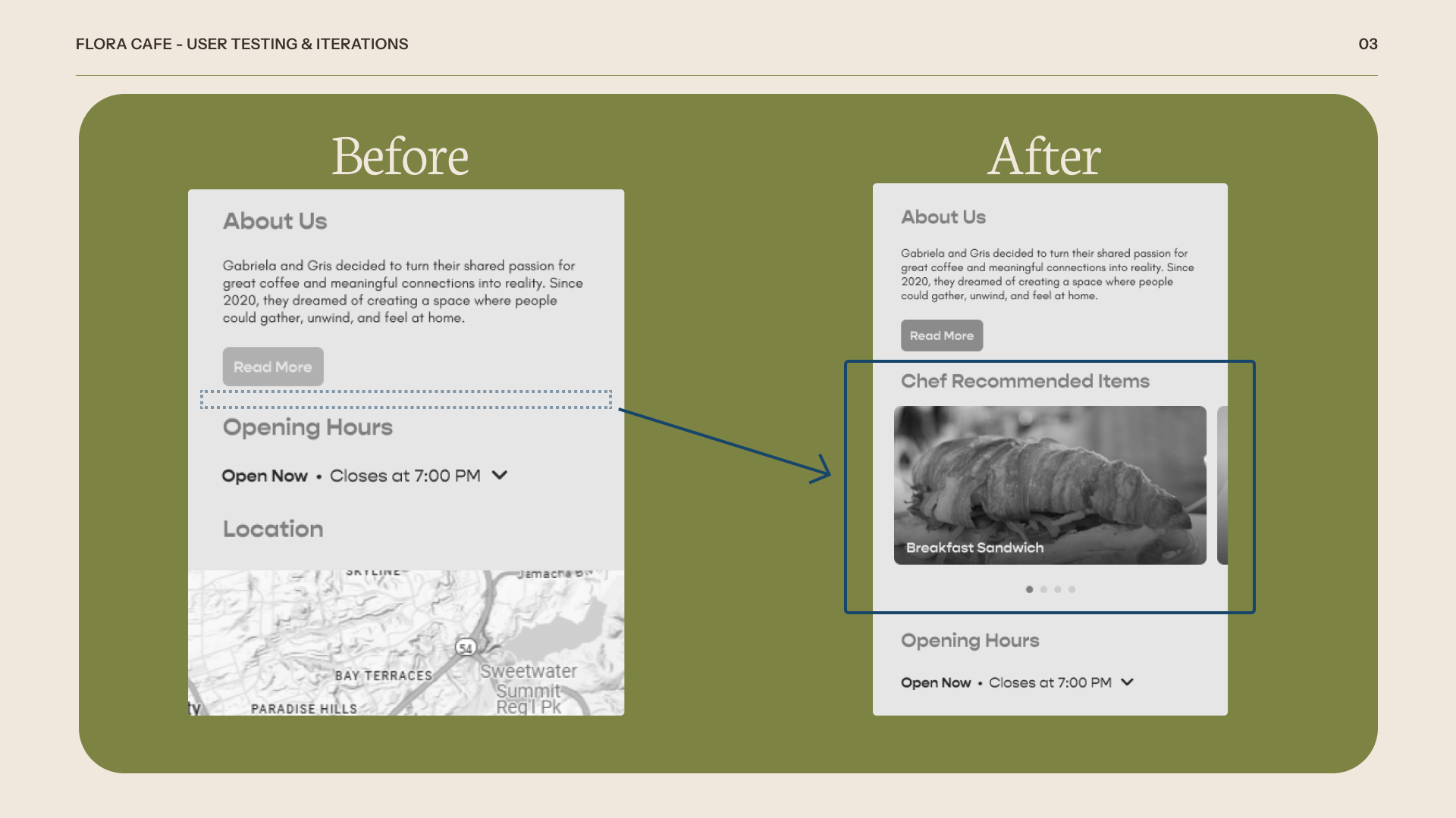
There's hundreds -- if not thousands -- of cafes in San Diego County. Some more successful than others. But the most successful ones definitely have a well-designed and functional website driving their customer growth and discovery. So, we performed deep competitive analysis on 5 different websites of cafes here in San Diego County to learn from those who came before us.

What websites have already solved the problems we're trying to solve? (E.g. How do owners tell their backstory? How do websites design functionally interactive bits like hamburger menus? Dropdowns? Checkout? How do they display their opening times?) We don't have to reinvent the wheel -- in fact, in this case, we shouldn't try to. Users expect consistency between websites of similar content.

Below are some highlights from our analysis in which we explore the above questions. If you'd like to get into the nitty-gritty, knock yourself out!

Paris Baguette's location UX is great!

Cafe de la Flor's CTA buttons are effective!

Cafe Madeleine's information architecture doesn't make sense...

Overall...

04

Design

Wireframes are your best friend

Now that we know what's good and what's not, we finally began to design a functional wireframe for our website in which we address the organization and navigation of all of its content.

By creating these wireframes, we decide on the content, layout, dimensions, functional page controls, basic navigation, and site architecture without worrying about deep aesthetic choices (color, branding, etc.) just yet.

Below are my notes on the mobile iteration of the website. For details on the desktop version, that can be found here.

05

Polish

(Taste) testing!

Now, before we dumped even more hours into a final, realistic website prototype with design guidelines and actual images, we wanted to make sure it actually worked. Can potential customers do what they need to do on the site, like check location and hours? Is the site's architecture designed well enough that they can find the menu on their own?

To answer these questions, we performed a small user testing session with 2 participants of different age groups.

Our participants represented distinct levels of technology familiarity:
  • User 1 was a middle-aged mom with moderate experience using mobile devices but limited familiarity with desktop platforms, reflecting generally lower tech literacy.
  • User 2 was a tech-savvy 16-year-old high school student comfortable navigating both mobile and desktop environments.
This diverse testing group helped ensure that our design is accessible and user-friendly for a broad range of users—especially important given that older adults are one of Flora Cafe’s target demographics. The fact that User 1 was able to navigate the prototype with ease is a strong indicator that our design is intuitive, even for those with limited technological experience.

Feature addition: Chef recommended items

With the wireframes, we chose to focus on only the main features our client wanted for the home page: a short About Us section, opening hours, location, and contact. After user testing with a cafe fanatic, they mentioned how the first thing they try to find out about a cafe are its top menu items, in order to gain a better understanding of what they specialize in. So, we added a Chef Recommended Items section to the home page to accommodate this need.

Feature addition: Item tags

Again, in our wireframes, we simply had the menu items laid out with the name, description, and price. After user testing with a middle aged mom, they voiced the concern that a lot of people her age have dietary restrictions and/or preferences that make them care about the ingredients in their food. So, we added gluten-free and vegan tags to the appropriate items. And, going back to the previous change, we reflected the Chef Recommended items within the menu itself by adding a House Favorite tag to the recommended items.

Other design challenges

By far the biggest design challenge we faced is deciding how to design the menu for our mobile and desktop sites. Due to the sheer quantity of drinks that Flora Cafe has to offer, the Drinks section in the website's menu is quite long when scrolled through. So, we wanted to add a way for users to quickly and easily jump to their desired category of drink in the menu.

However, due to the difference in screen sizes between mobile and desktop, we couldn't come to a shared design solution between both platforms to achieve this functionality. We ended up implementing a dropdown on the mobile version to better fit its vertical orientation. For desktop, we went with a sticky sidebar with anchor links to make better use of its horizontal screen space.

06

Final design

Your home away from home

Home page
About Us
Menu
Contact Us
Mobile prototype
Desktop prototype

07

Conclusion

What I learned

Collaborating with a real client to design a real website for them was simultaneously terrifying and empowering. I was able to apply my design skills that I've learned from isolated class group projects to a real-world scenario where real people are affected.

Communication and constant feedback between you and your client is key!

In retrospect...

  • I would try to test with even more users after the final version of the prototype was completed. Maybe there are hidden usability issues that came up during our polishing phase.
  • A ton of hours were poured into the product -- some way past my bedtime. Time management is, again, essential.